Venice clearer water
In link of lockdown due to covid19 that reduce the movement of Venice’s boats including the 'vaporetti' or water buses, as well as cruise ships (reduction of human activity), these two photos ESA one took On April 2020 and the other on April 2019.
This shows how water quality is affected by the limitation of human activities as The Italian government imposed a nationwide lockdown on the 9th of March 2020.
The water now looks clearer because there is less traffic on the canals, allowing the sediment to stay at the bottom.

Home


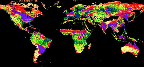
Co2 Net exchange
Because of the new Pandemic COVID-19, people have been in quarantine for over three months now, and curfews were set for most country, in order to limit the infections. Consequently, human daily activities have been limited, keep in mind that most of these activities cause harm to the environment. So logically the environment is going to be affected by this quarantine.
The net Co2 exchange is a measure of the net exchange of C between an ecosystem and the atmosphere. Less value meaning, there are enough planets that consume this Co2 and more oxygen is produced.
By using EOSDIS NASA world view, it was displayed how the Co2 net exchange between 1st January 2020 to 22ed May 2020 has changed, as the maps were observed. In the following two figures, the values of the Co2 net exchange at the beginning of the year 2020, in January, were pretty high, which means that the amount of Co2 was bigger than the amount plants can consume.
In figure 1, the maps were mostly purple and red, especially in Europe, Asia, and North America with few blues in South America, Africa, and South Asia. Fortunately, on the map of 22ed May 2020, the colors shifted more to green and blue, which indicate progress in lowering the value. Sadly, the net exchange of Co2 in big parts of North and South America has increased drastically being purple, but there are areas which goon greener, indicating less value.
One of the main reasons is the decrease in the Co2 net exchange, which is the limitation of human activities, which mostly produce excess Co2. Curfew and quarantine have definitely helped, and we can see this by the data discussed.

Figure 1 1 JAN 2020
Figure 2 22 MAY 2020
.jpg)